A Website Makeover for Canadian Author Kathy Stinson

This page may contain links to Amazon.com or other sites from which I may receive commission on purchases you make after clicking on such links. Read my full Disclosure Policy
Kathy Stinson has been a well-known author since the publication of her first book in 1982. Red is Best is considered a children’s classic, and she’s had new titles published nearly every year since.
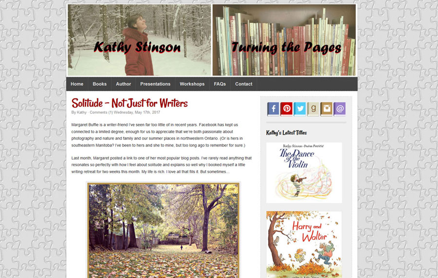
When I created Kathy’s original website in 1999, the home page looked like this:

It’s gone through many transformations since then – more than I can even remember – to incorporate information about new books and services, reflect changing design trends, and take advantage of technological advances.
Background
As her latest design was implemented in 2012, it was somewhat dated. Since it wasn’t a responsive WordPress theme, a plugin was required to make it mobile-friendly. In addition, design tweaks had been made here and there, resulting in a less than polished look.

By 2017, the site had grown to 110 pages, including several for each of her books. The blog had at least 14 categories and over 500 tags. As a result, navigation had become a bit of a nightmare.
Because each version of the website was built on the previous one, and due to the number of pages, neither of us had ever taken the time to go through the entire site with a fine-toothed comb.
We both agreed that it was time for a fresh start.
Approach
When creating a website or other marketing materials, one of the most important steps is to identify your target market. Kathy has always struggled with this, but an in-depth exploration helped her determine that she should focus on the people who buy her books (teachers, librarians, and parents) rather than the children and teens who read them. This helped her to fine-tune her message accordingly.
Next, we went through the site together, identifying blog categories that were no longer relevant, pages that could be combined, and much more. Kathy also worked on her own to rewrite much of the content.
A review of the blog tags revealed that none of them were particularly useful in terms of helping readers to find related content, so we decided to delete all of them.
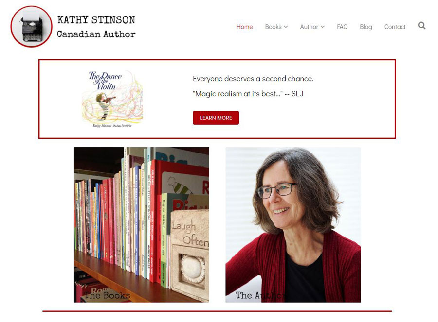
The blog was previously featured on the home page so readers could immediately access new content. Although Kathy’s still blogging regularly, we decided that wasn’t the most important part of the site. The home page now focuses on what’s most important: the books, the author, and the latest news. A special section features a selection of her best blog posts from each category.
I also set up a shopping cart to allow purchasers of Kathy’s ebook, Writing Picture Books: What Works and What Doesn’t, to download it immediately. Previously it had been sent out manually by email.
Results
By consolidating information, eliminating pages for out of print titles, and removing material that’s no longer relevant, we were able to reduce the number of pages from 110 to 36 – without losing anything important. Kathy can now spend less time responding to emails, as visitors can find the information they need more quickly and easily. Fewer pages also means less work keeping the information on those pages current!
Having identified her target market as adults meant a more “grown up” professional design than any previous versions of the site too.
I’m proud to show off this latest addition to my portfolio, as well as Kathy’s comments on the project:
“Working together with Janet to create my new website was such a pleasure. How the whole process would work was clear from the start. At each stage she was both ready with ideas for making it appealing and effective, and open to my ideas. And she was diligent about solving technical issues that go far beyond my understanding until everything was just as we wanted it. “Good enough” is not in Janet’s vocabulary!”
Kathy has quite a few new opportunities on the horizon and I’m sure she’ll be sharing details on her blog when the time is right. There’s no question that she’s a highly skilled writer, but I’d like to think her shiny new website may have something to do with it too!
Are you thinking about a website makeover or a brand new website? Let’s talk soon!

Janet Barclay
I eliminate stress for my clients by hosting, monitoring, and maintaining their WordPress sites so they don’t have to worry about security, downtime or performance issues. When I’m away from my desk, I enjoy reading, photography, cooking, watching movies, drinking tea, and spending time with my family.


Great work Janet! Love the new site, Kathy!
Thanks, Pam! It was a very exciting project to work on.
Kathy’s new site looks great! I love the typewriter logo/icon in the top left corner. Amazing how prolific she is! I can see that the work ethic runs in the family.
She’s pretty amazing, isn’t she? 🙂
The new site is really so much better. These posts always get me wishing I had more $$ to invest in a new site! In the meantime, I pick up pieces of learning from you here, Janet. Her quote about you is so loving… we all do rely on you to give us the best outcome!
You’re so sweet, Seana! Hopefully some day we’ll have a chance to work together on a new site. 😉
What a lovely website, Janet. Streamlining the process to focus on the actual visitors/customers is crucial. Spending time on who the customer is, what they are interested in, and how they respond to different forms of communication before redesigning a website is so important. It will engage them more effectively. Some people forget to do this part and rush into production. The result is usually less than satisfactory.
You hit the nail on the head with that comment, Sabrina! Now I insist on exploring those questions with my clients before I even take on a new project.
Looks really great Janet. I love how the website and the focus on the target market and what is important has come together as you did the website. I know I need to work on this as well. Like Seana, I will need to evaluate the funds. Your advice and support is priceless.
Thank you, Kim! In the meantime, I’m thankful for the opportunity to help you with your existing site.