Is your website giving you strong results?

This page may contain links to Amazon.com or other sites from which I may receive commission on purchases you make after clicking on such links. Read my full Disclosure Policy
You know the important role of a website in growing a profitable business. But is your website doing its job?
- Is it presenting the best first impression of you and your brand?
- Does it confidently proclaim your expertise?
- Do visitors instantly know what you do and who you work with?
If you can’t answer those questions with a resounding “Yes!” your website could definitely use some work.
When someone lands on your site and doesn’t immediately understand what you do, your chances of holding their interest are pretty slim. And if you don’t capture their attention within a few seconds, they’re likely to click off the page and never return. Yikes!
Clearly, your website has a big job to do, and it has to do it quickly. Some say in three seconds or less!
First impressions are important, and you simply can’t afford to waste those precious few seconds with a new visitor.
With a well-planned website, you’ll enjoy:
- Better name recognition
- More partnership opportunities
- Increased sales and profits
- Higher fees
- More speaking engagements
In addition, your website will present the professional, polished image you want the world to see.
As I promised in my latest newsletter, I’m putting together a new series of posts about the elements that should be included on the key pages of your website, starting today with the homepage.
Creating an Effective Homepage or Welcome Page
Your homepage or welcome page is often the first thing visitors see when they arrive on your site. For that reason, it should quickly inform them who you are, what you do, and most importantly, what’s in it for them.
I really can’t stress that last point enough. Keep in mind that before you can show potential clients how you can help them achieve their goals, you must have a clear vision of your target market!
A lot of people struggle with their homepage. Some see it as simply a gateway to the rest of their site and include next to no meaningful content. Others try to include so much that visitors can easily get overwhelmed, not knowing where to look or what to click on.
The perfect balance is to include just enough to let your ideal client know they’re in the right place and guide them toward the next step in their buying journey.
In a recent blog post, my colleague Imogen Allen recommended the following elements to make your homepage effective:
- Simple navigation
- A “hero” section that provides a quick snapshot of your business
- An overview of your main services
- A clear call to action
- Social proof in the form of testimonials
- A valuable lead magnet to encourage email signups
- A footer which includes links and/or other information that should be readily available throughout your site
For additional details on each of these items, be sure to read Imogen’s post, What makes a good website homepage?
Now, let’s take a look at these principles in action.
Homepage Example
The following example was based on the Basic Organization homepage as it appeared at time of original publication. The site has since been redesigned, but most of the described elements are still in place.
When you look at the Basic Organization homepage, you’ll see all of these elements strategically positioned.
The navigation is simple, consisting of only the five key pages.

There’s a hero section which includes a snapshot of the business, including a short video.

The main services are clearly featured, with links to additional details.

The call to action appears prominently in various positions on the page.
![]()
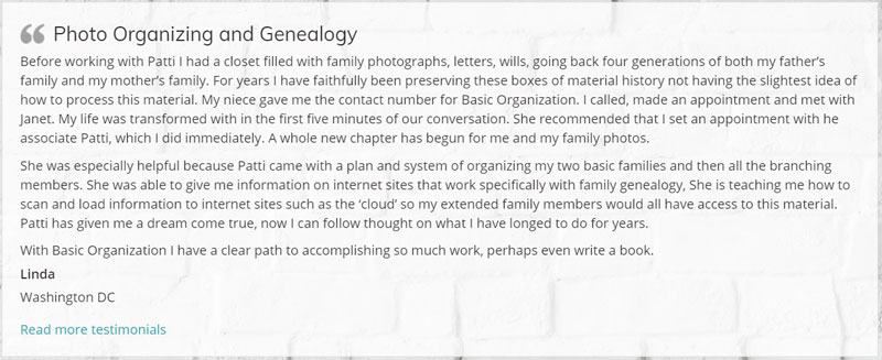
The testimonial slider provides social proof.

The footer includes links to other key pages, contact information, social media links, and a signup form for the e-newsletter. Offering a free gift to new subscribers, often referred to as a lead magnet, would make this even more effective.

Next Steps
Study your own homepage. How many of these elements do you have? Would a homepage makeover help you get better results from your website?
If you need to develop a strategy for your homepage, or even your entire website, why not schedule a telephone call or Zoom session? I’d love to help you achieve your business goals, so I’ve cut the prices in half until April 30th.
Illustration © Faithie / DepositPhotos.

Janet Barclay
I eliminate stress for my clients by hosting, monitoring, and maintaining their WordPress sites so they don’t have to worry about security, downtime or performance issues. When I’m away from my desk, I enjoy reading, photography, cooking, watching movies, drinking tea, and spending time with my family.


So what is interesting is that I have it set up so people land on my blog page, since is the page that has the most vibrant content. I know my homepage needs some serious help. I feel like I should be using this time to make progress on improving my website, and yet I’m lacking motivation. Isn’t it interesting that I have more time but less motivation? Nonetheless, I’m reading and taking notes because I know it needs to be done. Stay healthy, Janet!
Seana, I can totally relate to having more time and less motivation. There are many things that I’ve been wanting to work on but haven’t had the time, but now that I have more time available, I don’t feel driven to do them. Hang in there, my friend – we will get through this!
As you know, I went through a significant website consolidation (combining two websites into one,) upgrading to the new Squarespace platform, and redesigning everything. The new site launched at the beginning of 2020. Previous to that, you did evaluations for me on my two older websites. Your feedback was so valuable as guides for this redesign. Based on your post, I’m not sure I included all of the elements that you suggested should appear on the homepage. However, I feel my new ohsoorganized.com site does a great job letting people know who and how I can help, and also presenting a welcoming, friendly place for information and inspiration.
The other thing I realized from reading your post is that while we spent time designing and figuring out how each of the pages and sections would be, we allocated the most time getting the home page “right.” It was also the basis for how all of the other pages looked. And that supports what you’re saying about the importance of having a solid homepage.
I agree that your new website is awesome, including the home page. I’m glad the evaluations I did helped you achieve that!
I am looking forward to this series! I agree that the home page is important. While I earn income blogging, as well as doing services, I find that an image on the side bar helps get potential service clients to the right section of the website quickly and easily.
What type of image are you referring to?
Great wisdom, Janet! I know all your advice is true and right and correct. And yet I hate modern websites, as a whole. I liked it back in the old days when everything was text and it all stayed still! 🙂 I know, I sound like an oldster, but so many sites have sliders and moving elements, and they make me seasick! I have to wrap my mind around the need to have lots of pictures and few words, but I’m not a visual person — I process everything in my brain in words and my mind pretty much ignores photos (unless there are babies in them).
But thanks to your article, I recognize clearly that while I have all of those elements on my site, per se, they are not all on the home page. Back to the drawing board!
I’m not a big fan of sliders either, but I do love a nice photo! Maybe you need to get a picture of yourself with some friends’ or random strangers’ tiny humans. 😀
Thanks for featuring my web site Janet. It was great working with you to reinvent my site. Your knowledge was priceless. I see so many more visitors and much more engagement on my new site and the home page is the most important page.
Hey, thanks for letting me feature it! We did a great job together and I’m glad to hear that it’s working for you.
I spend so much time on my blog and have completely ignored my website. I know it needs updating. ( I have those sliders.)
It makes so much sense when you say that the first page has to clearly tell who you are and what you do-quickly. Also, what’s in it for them.
I know that when I visit websites, if they’re too difficult to navigate, I hop off. That’s something to keep in mind!
That’s a common issue, Ronni. People invest a lot of time and money getting their websites up and running, and then they forget about them. You need to make sure it’s still working for you!