A Website Redesign for Basic Organization
This page may contain links to Amazon.com or other sites from which I may receive commission on purchases you make after clicking on such links. Read my full Disclosure Policy
One of the biggest compliments a web designer can receive is to have the owner of a site they’ve created return for a redesign a few years later.
Background
Basic Organization was established in 2005 and launched their first website a short time later.
Owner Janet Schiesl and I first worked together in 2014. The goals of that project were to convert her existing website to WordPress while maintaining the same design, and to integrate her blog, which was on a separate site. At that time her sites looked like this:
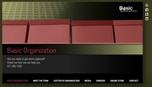
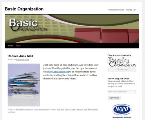
The new website looked like this:
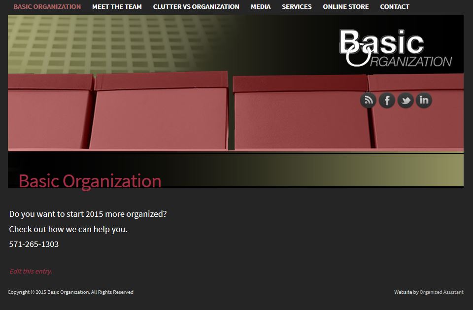
Although it had a few revisions since then, by last year the design was somewhat dated and no longer portrayed the image Janet needed to take her company to the next level. I introduced her to Susanna Miles to audit her business marketing and develop a strategy for the future.
After working with Susanna, Janet came back to me and we began making plans for her website redesign.
Approach
In addition to a more modern design, Janet wanted to make it easier for potential clients to find information, especially on mobile devices. One step in this process was to reduce the number of pages by combining content from various short pages into longer, more informative ones.
Janet and I worked closely together, meeting on Zoom every week to review progress and discuss next steps. Her involvement and commitment to the process kept us both on track and allowed us to launch the site when planned.
Results
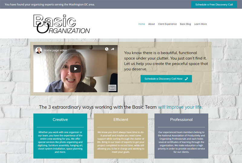
I’m thrilled to share Janet’s new website with you!
Note: Another redesign was completed in 2022.
Streamlining her content has made it much easier for potential clients to find their way around the site and reduced the likelihood of them missing key information. As a result, they have a better understanding of how Basic Organization can help them with their challenges. And when they’re ready to ask for help, they can simply click on one of the buttons which appear prominently yet discreetly at the top and bottom of every page.
These changes have benefitted Janet as well. Clearer messaging on the site means she can spend less time responding to routine questions, and online scheduling cuts down on back-and-forth emails.
Here’s what Janet said about this project:
Wow! I just finished working with Janet Barclay on a complete overhaul of my company web site. What a great experience. I have been working with Janet for years, since she first converted an old site to WordPress, but I contacted her a few months ago because I knew that I needed a professional to get me through a long-needed update. Janet scheduled out appointments and outlined our work so that it was much easier for me to wrap my head around what needed to be done. She is so creative and at the same time analytical in finding solutions to whatever I asked of her. She made the this big project so doable for me. If you are considering a new web site or an update of a current site you need to speak with Janet Barclay.
I’m already booking new projects for the spring, so if you’re thinking about a new website, let’s talk soon!

Janet Barclay
I eliminate stress for my clients by hosting, monitoring, and maintaining their WordPress sites so they don’t have to worry about security, downtime or performance issues. When I’m away from my desk, I enjoy reading, photography, cooking, watching movies, drinking tea, and spending time with my family.



Janet Barclay redid my website too. I love it and second everything Janet Schiesl said.
Thank you, Kathy! Your projects were so similar that I almost linked to your case study in this post, but didn’t end up doing so.
Janet’s new site looks great! I love the lighter color scheme, the video welcome, and the easy entry in. It’s so inviting!
What a great makeover! Much more modern and approachable. I had a similar experience when Janet redid my website last year. She continues to be my go-to for issues and changes.
I really love the new, lighter look. It is very friendly and inviting, and I love seeing Janet’s face when you land on the sight. In this business, the personal touch is so important. We work in the tiniest details of people’s lives, so it is important that they feel comfortable with us. The video welcome is a great way to put potential clients at ease! You have a wonderful touch, Janet.
The website looks great! Great job, Janet. Over the years, I found that the clearer the content pages about my services, the more likely I would get a better quality client. Thanks for sharing.
Wow, what an impressive transformation! The older website seems dark and almost discouraging. The new one is so much lighter, brighter, and inviting! Janet, I’ve told you before that I wished that I had known about you years ago, before I had my business website created for me by someone else. You are so talented!
Thanks for all the wonderful comments! What a great way to start the week!
I love the redesign! Great job clarifying her message and giving the site a more modern look!
Nice redesign! I’m sure mine could use some sprucing up, beyond what I have done for myself, since Janet did exactly the same thing for me as she did for Janet (ha ha, sounds funny) in 2012. Meanwhile, I just recommend her services every chance I get!
And I really appreciate it, Hazel!