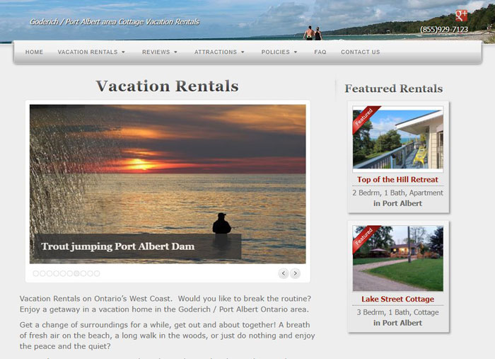
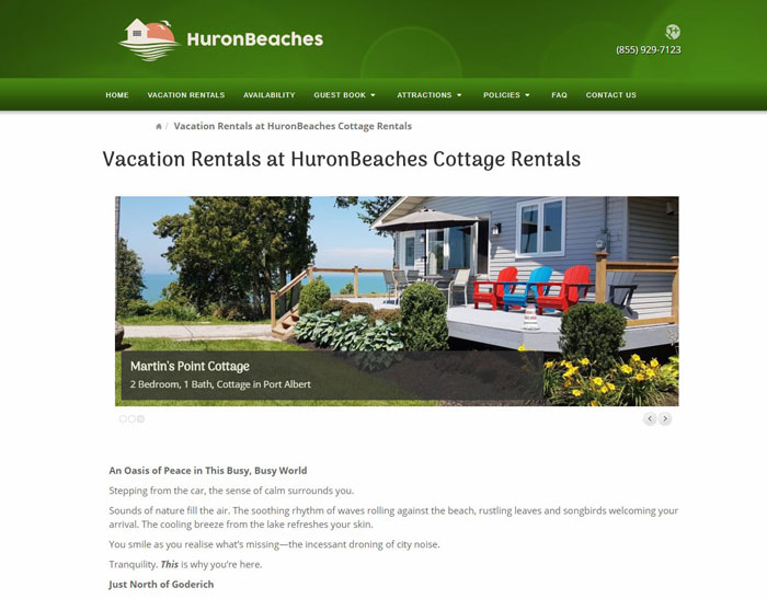
A more engaging vacation property rental website

This page may contain links to Amazon.com or other sites from which I may receive commission on purchases you make after clicking on such links. Read my full Disclosure Policy
I recently had the pleasure of helping Keith with his online presence. He had created a website for his vacation rental property, but it wasn’t generating as much business as he wanted.

Branding
The first step was to give the site more visual appeal, to capture visitors’ attention quickly and make it more memorable. Enhancements included:
- A logo, for a more distinctive brand.
- A more colorful design. I suggested green, because its association with balance, harmony, and nature would tap into the emotions of his audience.
- Larger photos, featuring the properties rather than the surrounding area, for a more up-to-date look and feel.
Although Keith was open to a new WordPress theme, I was able to make these changes within his existing theme, keeping project costs down.
Readability and Engagement
On my advice, Keith removed outdated information and improved the site navigation for better usability.
I introduced him to a professional copywriter, who re-wrote the site content to be more compelling. This includes a brand new About page, so potential customers can get to know the person they will be renting from.
Keith said, “Thank you so much. You did a great job and I am sure the effort will pay off for us.”
Future Marketing Plans
Work has already begun on some new marketing initiatives to help Keith stay in front of customers and prospects during the off-season. Because when it comes to online marketing, you have to:
- Get people on your site.
- Keep them on your site.
- Keep them coming back!
It’s going to be hot once the word gets out, so if you’re looking to rent a cottage on Lake Huron, be sure to check out HuronBeaches.ca!
Are you thinking about a website makeover or a brand new website? Let’s talk soon!

Janet Barclay
I eliminate stress for my clients by hosting, monitoring, and maintaining their WordPress sites so they don’t have to worry about security, downtime or performance issues. When I’m away from my desk, I enjoy reading, photography, cooking, watching movies, drinking tea, and spending time with my family.


I always love “before” and “after” shots. It is so energizing to refresh your website and start over. You made some wonderful suggestions to improve his sight, Janet! This is making me want to get away from it all and spend a week in a cabin in Ontario:)
Thanks, Seana! I’m not sure what’s considered a cabin in Connecticut, but these are better than your average cottage. Scott and I have stayed a few times, and I’ve been inspired to make a few upgrades at home based on my experience at HuronBeaches!
It’s so fascinating to see what people respond to or what draws their attention. And being that our attention is constantly being bombarded with input from so many sources, it’s that split second which keeps us somewhere long enough to engage…and hopefully engage again and again. How lucky Keith is to have your support and expertise with the redesign of his website. I hope it generates all that he wants it too.
Thank you, Linda!
Great transformation, Janet. I love the idea of getting a copywriter to rewrite the pages. I will be checking her out. I just don’t have the time to update the pages anymore. It’s helpful to get a support team set up we don’t have to wait and get things done right now. Thanks for sharing.
Sometimes we’re too close to our own businesses to see what needs to be said. I think you’ll find Joan is quite wonderful to work with!
Love the refresh you did for Keith! Your point about readability and engagement is so so key in any industry and for any website, but especially for one in the rental property market. Thanks for letting us get a glimpse into the refresh!
Thank you, Lisa!